
How Many Coats of Paint Are Needed for Interior Walls?
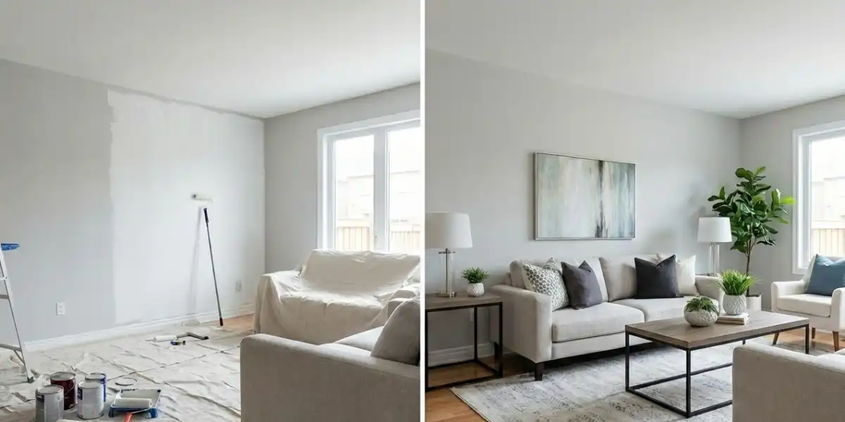
If you are planning to refresh your home, one of the most common and important questions is: how many coats of paint are needed for interior walls? The answer is…


What Is the Function of Colour in the Physical Identity of Buildings? In architectural discourse, colour is often misunderstood as a secondary or decorative layer applied after form, structure, and material decisions have been finalised. However, when examined critically, colour functions as an architectural system that operates alongside geometry, construction, and spatial organisation.
The physical identity of a building is produced through the interaction of these systems, and colour plays a key role in making architectural intentions legible.
It contributes to how volumes are perceived, how elements are prioritised, and how relationships between parts and whole are established. Rather than being an emotional or symbolic addition, colour can be deployed analytically to clarify architectural order. In this sense, colour works as a tool of visual organisation, capable of reinforcing or redefining architectural logic without altering physical structure.
It mediates between the abstract design process and the concrete experience of the built form, translating architectural decisions into immediately readable information. Within professional practice, colour selection is therefore increasingly treated as an integral component of design development, informed by context, material performance, regulatory frameworks, and long-term durability.
From a theoretical perspective, colour participates in the construction of architectural identity by stabilising perception. Buildings exist over time and are encountered under changing conditions of light, weather, and use.
Colour helps maintain recognisability across these variations, allowing a building to retain a consistent visual presence. In Australian architecture, where strong daylight and environmental exposure intensify visual contrasts, colour becomes particularly influential in defining architectural character. The strategic use of colour can mitigate glare, moderate visual intensity, and support legibility at both urban and human scales.
When treated systematically, colour contributes to architectural clarity rather than visual noise. It supports the discipline of architecture by aligning aesthetic outcomes with functional and environmental logic. As such, the function of colour in the physical identity of buildings lies in its capacity to organise perception, reinforce design intent, and sustain coherence across multiple scales of experience.

Exterior colour plays a decisive role in shaping how a building is perceived within its urban, suburban, or landscape context. The external surfaces of a building form its primary interface with the public realm, making colour a key factor in first impressions and long-distance recognition.
Through colour, architectural mass can appear heavier or lighter, larger or more restrained, depending on tonal value and contrast. Light colours often reduce the perceived weight of a structure and assist in integrating it into its surroundings, while darker or more saturated colours can assert presence and define boundaries. In dense urban environments, exterior House Painting colour contributes to streetscape continuity or disruption, influencing how individual buildings relate to neighbouring structures. In this way, colour participates in the collective identity of the built environment as much as in the identity of a single building.
In the Australian context, external colour selection is closely tied to environmental performance and material behaviour. High solar exposure necessitates careful consideration of heat absorption, fading, and maintenance. Colour is therefore not only a visual decision but also a functional one, linked to sustainability and longevity.
Exterior colours often emerge from material choices such as concrete, brick, metal, or timber, where inherent material colour becomes part of the architectural language. When artificial colour is introduced, it is typically justified through contextual response, regulatory requirements, or programmatic clarity.
For example, civic and institutional buildings may use restrained colour palettes to communicate permanence and neutrality, while commercial Painting or educational buildings may employ more distinct colour strategies to signal accessibility and function. Ultimately, the function of exterior colour in architectural identity is to position the building within its physical, environmental, and social context, enabling it to be read as a coherent and intentional object within the broader urban fabric.

Interior House painting colour operates at a different scale and addresses a different audience, yet it is equally critical in shaping the physical identity of a building. Inside a building, colour influences how spaces are navigated, understood, and used on a daily basis.
It contributes to spatial hierarchy, helping occupants distinguish between primary and secondary spaces, circulation zones, and areas of specific function. Unlike exterior colour, which is perceived largely from a distance, interior colour is experienced at close range and in relation to light, texture, and material detail. This proximity makes colour an effective tool for organising spatial experience without relying on additional structural elements. Through controlled variation and repetition, interior colour systems can reinforce architectural order and support functional clarity.
In non-residential architecture, such as schools, hospitals, and offices, interior colour is often employed strategically to support wayfinding and programmatic legibility. Colour coding can assist users in navigating complex buildings, reducing reliance on signage and improving spatial comprehension.
Even in residential architecture, interior Residential House painting colour contributes to the physical identity of the building by articulating relationships between rooms and defining the character of shared versus private spaces. Importantly, when used in a disciplined manner, interior colour does not function as an emotional stimulus but as a spatial instrument. It responds to lighting conditions, surface reflectance, and scale, ensuring that spaces remain visually coherent under varying conditions.
In Australian interiors, where natural light levels are often high, colour must be calibrated carefully to avoid visual fatigue or excessive contrast. The internal identity of a building is therefore shaped through colour systems that prioritise clarity, usability, and consistency with the broader architectural concept.
The strongest architectural identities emerge when internal and external colour strategies are conceived as parts of a unified design framework. While the functions of interior and exterior colour differ, their relationship contributes to the overall coherence of the building. Alignment between external and internal colour systems can reinforce architectural intent, allowing users to intuitively understand transitions between public and private, exterior and interior, open and enclosed spaces.
This does not require identical colours on both sides of the building envelope, but rather a consistent logic in tonal relationships, material expression, or chromatic hierarchy. For example, an externally restrained colour palette may be complemented by a more articulated interior system that maintains the same underlying order.
Conversely, deliberate contrast between external and internal colour can also be a valid architectural strategy, particularly where functional or environmental conditions differ significantly. In such cases, colour marks thresholds and transitions, helping occupants register spatial change.
What is critical is that these decisions are intentional and grounded in architectural reasoning rather than stylistic preference. In contemporary Australian practice, this integrated approach reflects an understanding of colour as a long-term contributor to building performance and identity.
Colour must accommodate ageing, adaptation, and changing use while maintaining legibility over time. Ultimately, the function of colour in the physical identity of buildings lies in its ability to connect form, material, space, and use into a readable and coherent whole. When applied systematically, colour becomes an essential architectural tool, shaping how buildings are perceived, navigated, and understood within their physical and cultural contexts.

All rights reserved for Finish Painting & Maintenance Pty Ltd
ⓒ Copyright 2026